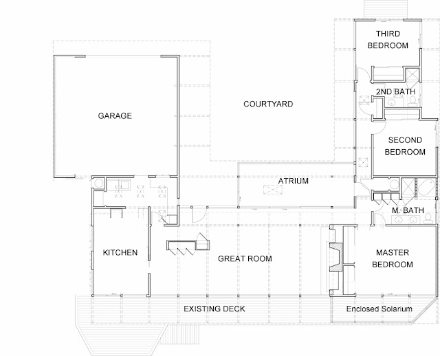
As promised, a walkthrough of the other side of the house, the bedroom wing. This end is still a little up in the air and depends on if we refinish the shed for Shawn’s office right away or down the road.
This is the long wood hallway of the bedroom wing:
We were tinkering with the idea of extending the windows on the left which overlook the courtyard to the ground. We thought that may expose this side of the house too much. We may still make them a little bigger. There are two skylights which give off a nice diffused light.
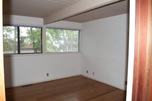
Third Bedroom
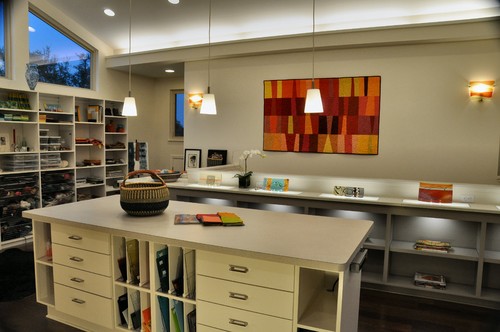
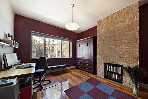
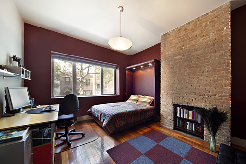
We decided this would be my sewing room/office since it gets the most natural light. Shawn’s going to use the spare bedroom for now. I think.
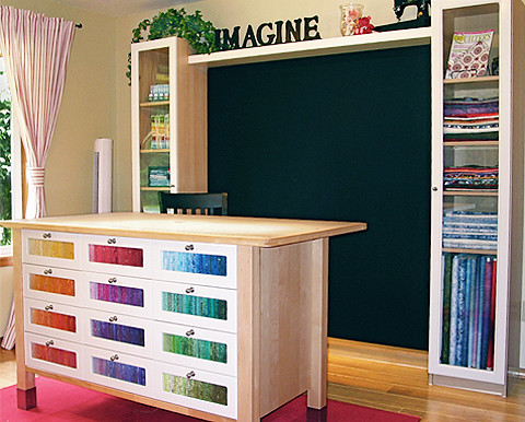
Up
…And down
Available from Bedder Way.
Second Bathroom
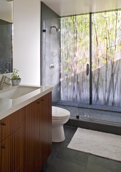
This will be gone gone gone! That color is hurting my eyes! The bathroom will be changed around so that the shower will be larger and will be at the end of the room like this:
Master Bath
Mid Century Moderns seem to favor a lot of wood panelling. Unfortunately this reminds me way too much of my parents basement. I can see keeping small portions of the wood panelling for accents, though.
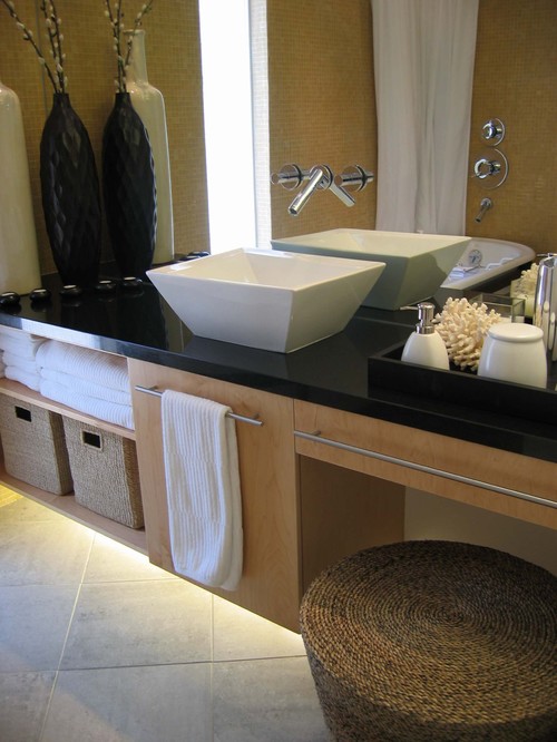
The master bathroom has a stand up shower stall and a large square tub. We discovered some empty space behind the wall on the left side so the bathroom will be widened. The tub is going to be taken out to make way for a much larger shower. The toilet will be moved to a separate room towards the front. The counter will be elongated keeping the 2 sinks but adding a vanity area in the middle with a stool: Something along these lines, except I don’t like the black counter:
Still lots to think about and decide on. I highly recommend the website Houzz.com and their app, where all of my idea photos have come from.
But be careful, it’s highly addictive! I now carry my iPad everywhere looking at house porn!






Your house has great bones and I love your inspiration photos! Can’t wait to see your ideas unfold. Thanks for stopping by my blog.
Thanks, Tanya. I’m excited for what’s to come!